
Liquidity Zones
Trading with Delta and finding Liquidity Zones
Delta is a simple measurement of ask volume minus bid volume, and many traders use various forms of delta to infer who is the most aggressive participant in the current auction. Today I'll walk you through how I use delta to identify a very simple trade setup which I will refer to as a liquidity zone.
Before diving in, let's cover some basic methods for finding delta on a chart. For a deeper breakdown of each form, see our footprint chart guide.
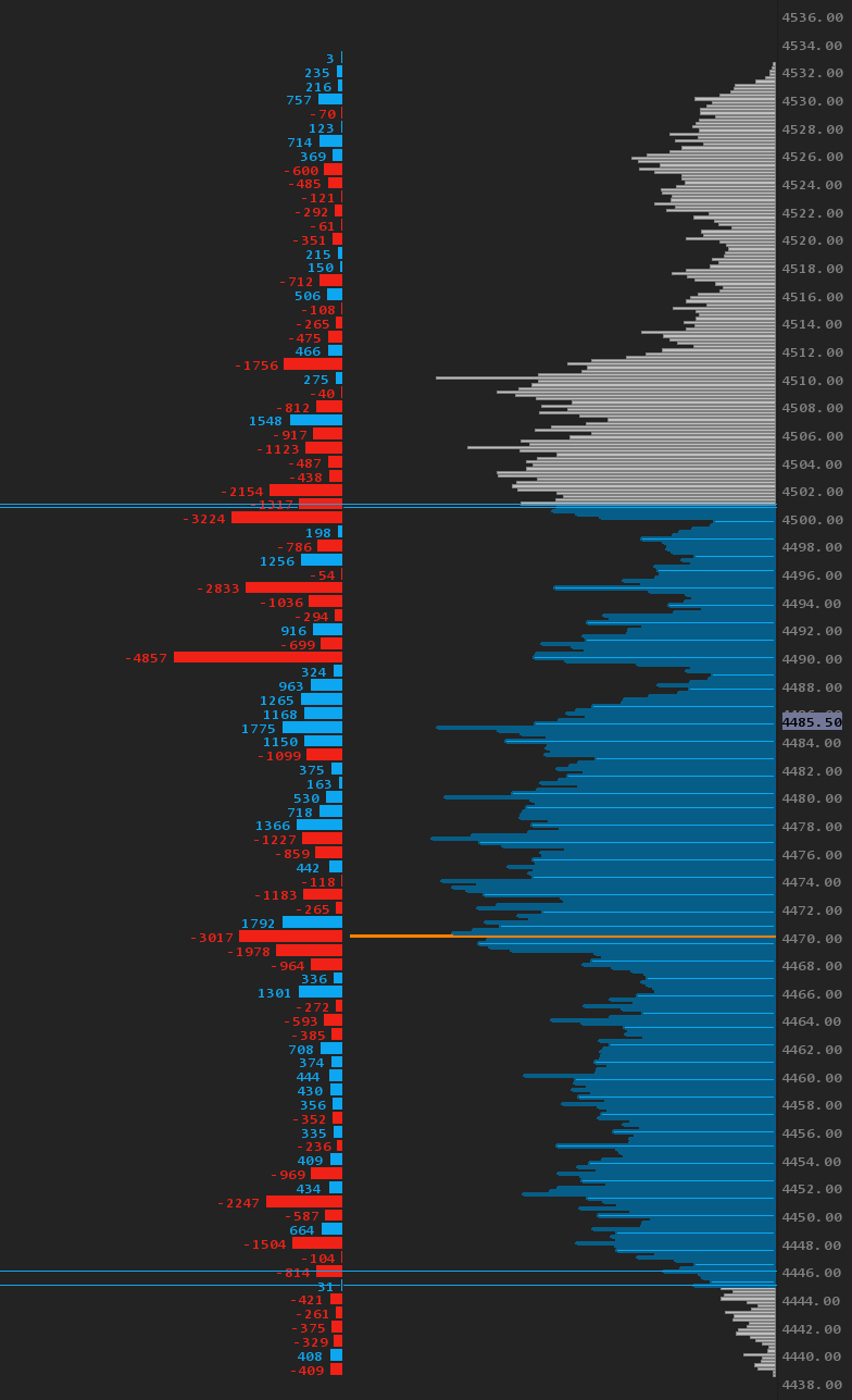
Delta Profile - If you have followed me or any of the guys from OrderFlow Labs before you might be familiar with this view. It is simply a volume profile chart, but instead of calculating total volume it is calculating ask minus bid volume and displaying that vertically like a standard volume profile.
In the picture below you'll see this example of a delta profile (which I usually have displayed next to my normal volume profile).
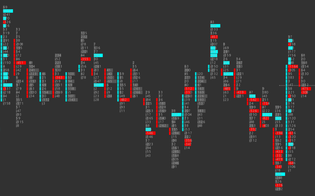
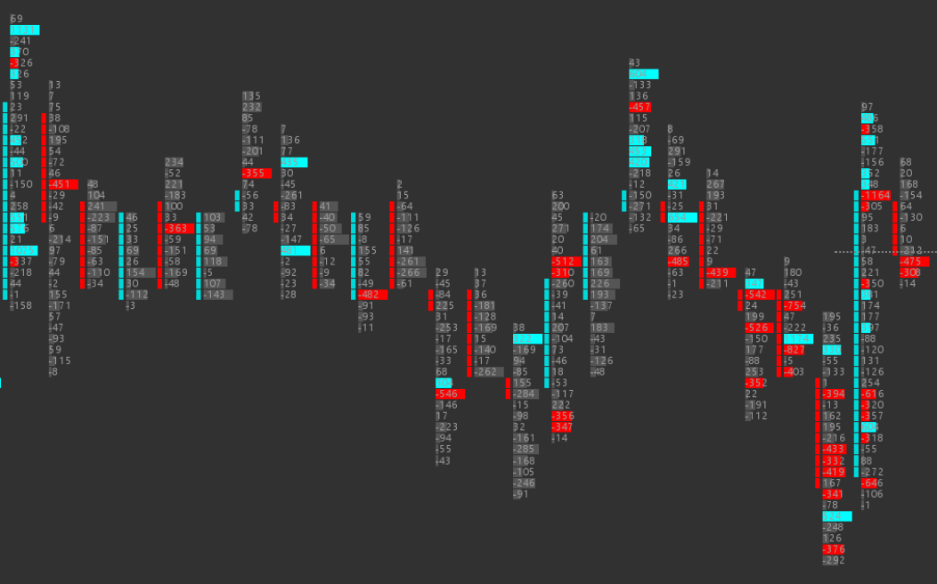
Delta Footprint - The next easiest way to view delta is on a footprint chart. Using the same calculation of ask minus bid volume, we can build a footprint chart that shows not only delta but also where and when that delta or volume was transacted. As opposed to the delta profile above, where you'd have to be watching the profile all day, the footprint lets you see this and what happened next, which is key. Example of this type of chart below.
Cumulative Delta - Likely the most useless form of a delta measurement (yes I said it) is a cumulative tally of the delta of the entire session, displayed as a histogram. I don't have any examples because I don't use it. The biggest issue I have with cumulative delta is that you can't see where this delta was created, and there are often extreme divergences between delta and price. I have seen many retail traders get super concerned about negative cumulative delta and price going up, or vice versa. Under the hood this divergence is usually just absorption. It's not a totally useless tool, but it's not paying rent on my charts.
There are other forms of visualizing delta but I would say these three are most noteworthy from a trading standpoint. I could probably mention bar delta but I'll leave some of the work up to you — the term "bar delta" is pretty easy to figure out.
Now that we've gotten through the nitty gritty, let's dive into a concept which I will refer to as a "liquidity zone" and you will likely know this setup as "trapped traders" — and that's fine :).
Leo, so what exactly is a liquidity zone? I'm glad you asked. Quite simply: this is an area of high liquidity where passive buyers or sellers use mostly iceberg orders or reloading the DOM to fill positions. For reasons that us retail traders shouldn't care about there's a large business to be done, and all we need to do is identify these areas and trade with them. This is where we will go to our handy dandy footprint chart and watch for this in the form of an accumulation of what? DELTA :)
Let's walk through an example.
First candle on the left we have one block of 1131 positive delta with another 320 and 326 of positive delta just below it. Perfect, we found some positive delta.
Now, let's dig into some theory on what is happening here.
One: There are aggressive buyers who are crossing the bid x ask spread, and those buyers (we assume) want to continue pushing higher.
Two: There's a passive seller "reloading the offer," most likely via an iceberg or by quickly reloading large size.
Three: Price is not moving.
Ok, so it doesn't take a genius to figure out something is "wrong" here… there are buyers attempting to move the price higher AND they are doing it aggressively (lifting the offer). They have… run into a wait for it… "Liquidity Zone" — insert evil smile here.
What happens next is the KEY here. We have identified an area of interest using delta as a measurement tool. One of two things will happen next: either the passive seller runs out of lots to sell, or the aggressive buyers no longer have interest in buying. There's a fight here, and until we see who's won or lost the fight we have no trade yet. We need to see the victor of this battle first.
In this example we see that the very next candle is a flush out of the previous candle, so now we know that buyers are likely losing this battle and we can trade against them on retest of this area. So we wait for these retests. Personally I want to make sure these sellers mean business, so I want to see price move away from this area at least a certain amount — in NQ for me it's about 30-40 pts, in ES maybe 4-5. Upon spotting this setup I'll draw a zone.
Now we have a decent idea that passive sellers are present in a certain area of the market, we have seen this on the footprint with delta, and we have observed that price has moved away from that area enough to give us conviction to find a trade setup. We have our box drawn and we wait.
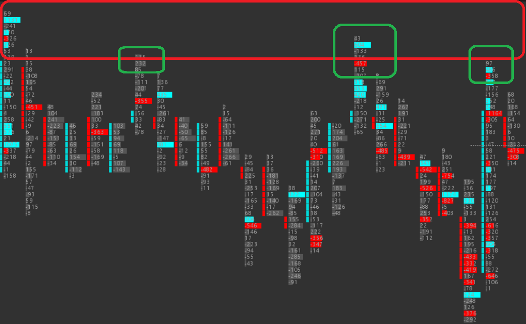
In the same example above we get 3 shots at this trade which would be a sell. Since we have made the observation that large sellers are present here we want to trade with them and sell too. Like all things in trading, however, we need to remember that there are no absolutes and this trade is likely only going to work a few times. I personally prefer the first retest and will watch the DOM and time and sales to confirm, but will also consider 2nd and 3rd retests about as sketchy as eating leftover pizza from 5 days ago.
Ok Leo… so why not call these trapped traders? You're actually likely seeing both in this trade setup, which honestly is what gives it its power. There are aggressive buyers and they get totally stuffed at the net, which means that at the same time there are passive sellers sitting on the offer. Once this area is rejected and price reverses, most are going to get stopped out, but there are likely larger participants who will hold and sell for breakeven. I would argue that the passive sellers here are the real story of what's happening. So you have both an area of high (in this case) sell liquidity and aggressive buyers running into that wall of passive sellers.
And that's it — an actionable trade setup. If you trade this often enough, you'll also start to recognize the related re-bid and re-offer pattern, which uses similar logic on a higher timeframe. It's also the same mechanic behind a liquidity sweep — when price runs the stops resting above a prior high or below a prior low, gets absorbed, and reverses.
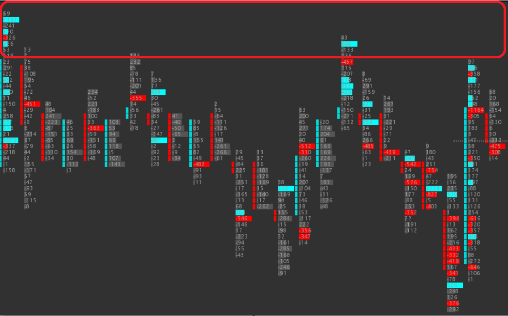
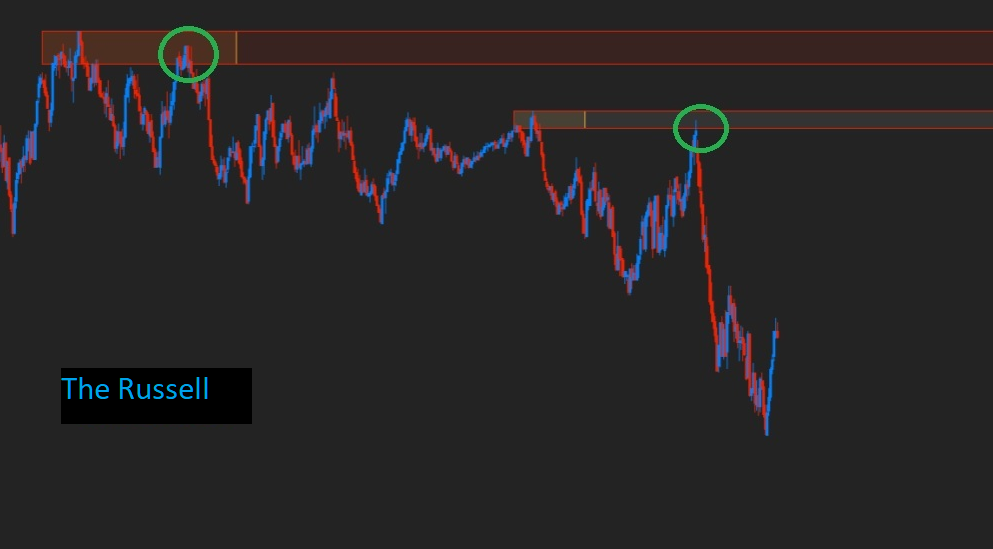
Now, something we have been working on at OrderFlow Labs is automating this setup. I personally get tired of looking and obsessing over footprint charts and trying to find these setups, so for the past few months we have worked with our team to automate identifying these areas from a delta perspective.
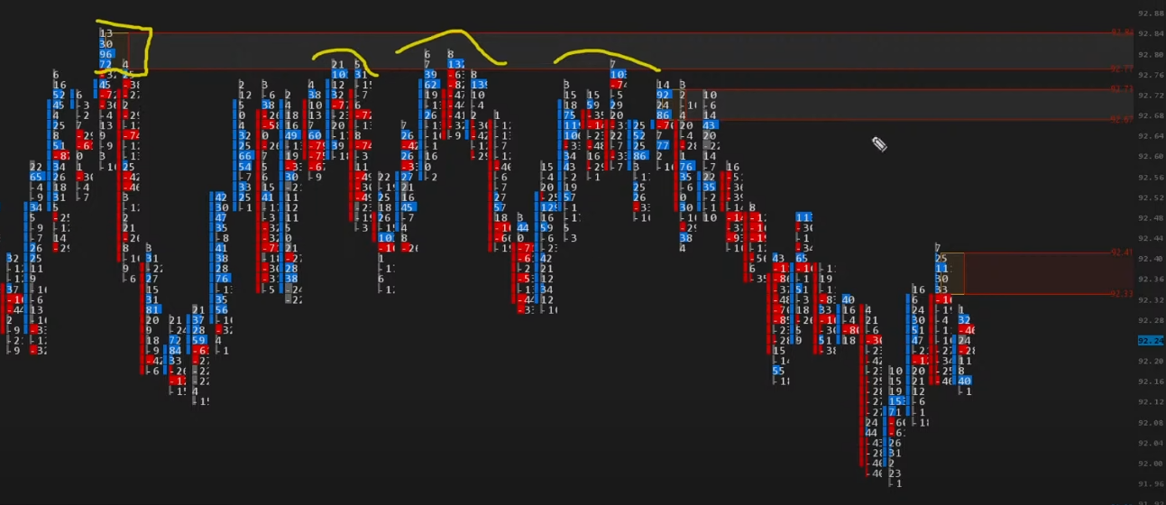
We take the footprint data (like in the above pic here in CL) and translate it right onto your candlestick chart, like in the pic below from the Russell. And like Horse says, F%$# Russell!
If you want to dig in more, we did a live webinar on Friday, Feb 4th, which was also the launch of this new study into our beta tools.
You can watch Fleri discuss how this works here: